top of page
Woman-Hoola-Hooping.jpg
Citrus Pattern

Turn Passion Into Progress

Articles and tools for creative-seekers, business builders, and the artistic-minded by Hart House Creative®.

Explore This Month's Most Popular Articles

New authentic artist stories, and resources you'll want to get your mitts on. ​Gain access to actionable tools, and boost motivation by squeezing an extra dose of creativity in your day with us.

Brand Identity

rococo-inspired

Dearest Artist,


This month, we’re reveling in the ornate, the whimsical, the unapologetically expressive. In celebration of Rococo Revival, we’re spotlighting artists whose work flirts with flourishes, dances with drama, and indulges in the beauty of excess — all in the best ways.


Inspired by the elegance and extravagance of the Rococo era, these modern creators channel the past not with imitation, but with reinterpretation. Their work reminds us that art can be both bold and soft, elaborate and intimate, serious and full of delight.

May their brushstrokes, palettes, and panache remind you that beauty doesn’t need to whisper — sometimes, it deserves to sing.


Keep creating with flair,

Jenn Hart


Here are a few artists from my hometown, Las Vegas, and my new home in the greater Philadelphia area that my team and I are crushing on. Enjoy their playful aesthetic with ornate details and decorative elements that remind us of the Rococo era.


Las Vegas Creatives:

@Cris_james_art - Cris James is an artist specializing in figurative paintings, primarily portraits of complex female characters, using mediums like watercolor and oil on paper.


@rosstakahashi- Ross Takahashi is a Las Vegas artist known for his sculptural works that explore themes of nature, death, and decay.


@Ericvozzola - Eric Vozzola is a Las Vegas-based studio artist and muralist known for his abstract patterns and surreal landscapes.


Philadelphia Creatives:

@Jlichiarts - Juana Lichi is a mixed media and digital artist known for her expressive portrait artworks that blend collage, embroidery, beads, rhinestones, and gold leaf into richly textured compositions.


@Robertolugowithoutwax - A Philadelphia-based ceramicist and activist, Roberto Lugo creates ornate pottery that blends classical forms with contemporary cultural references. His work often features intricate designs reminiscent of Rococo ornamentation.


@Sabrina.reichert.art - Sabrina Reichert is a Philadelphia-based artist and co-founder of Forest Lane Designs, creating intricate, decorative works that blend fine detail with a modern touch.


Everything we share here is meant to be helpful and inspiring. We’re speaking from experience. Please consult a qualified professional to help make decisions. You are responsible for how you choose to use this information, and we are not liable for any loss, damages, or issues that may arise. We can’t be responsible for how things play out, but we’re always rooting for your success!


Credits

Author: Hannah Heine

Editor: Jenn Hart (More About Me)

Associate Editor: Sarah Dawoud

Art: Sharon Bakas

Popular Related Articles

Subscribe to The Squeeze on our little piece of the internet to get design promotions, resources, stories about other creatives, and inspiration for your eyeballs and brainstorms.


Keep creating Hartists! Follow @harthousecreative on Instagram and Linkedin.


design work

Nostalgia Never Looked So Fresh


If design trends are any indication, the past is the future—and in 2025, nostalgia is coming in loud, bold, and printed. Forget muted minimalism. This year, expect to see leopard print, funky florals, checkerboard patterns, and swirly psychedelic motifs making their way into branding, web design, and digital artwork.


It’s a reaction to years of clean, sleek, and understated aesthetics—designers and consumers alike are craving vibrancy, personality, and a little bit of chaos. But how do you take these vintage-inspired patterns and make them feel fresh rather than dated? How do you incorporate them without making your design feel like it was plucked straight from a thrift store wallpaper aisle?


Let’s break down some creative ways to bring nostalgia-inspired prints into modern design work—without feeling like you’re stuck in a time warp.


Bold Backgrounds With A Modern Twist

One of the easiest ways to introduce nostalgia-inspired prints into your work is through backgrounds.


But instead of filling an entire canvas with a pattern straight out of the ‘70s, use it selectively:

  • Tone it down with overlays – A bold floral or checkered print can be toned down with opacity or texture overlays to make it feel more integrated rather than overpowering. Try using a semi-transparent gradient over your pattern to blend it with a contemporary color palette.

  • Break it up with negative space – Instead of fully covering your design in leopard print or a groovy swirl, let the print interact with a clean, modern layout. This creates contrast and keeps it from feeling visually overwhelming.

  • Pair with sleek typography – A chunky Y2K-inspired holographic print can be beautifully balanced by a modern sans-serif or a crisp, elegant serif. The contrast between retro and refined makes the design feel intentional.


Statement Typography With Pattern Fills

Who says text has to be solid? One of the most exciting ways to bring in nostalgia-inspired prints is by filling typography with them.


  • Think leopard-print letters for a rebellious, punk-inspired brand.

  • Try Y2K holographic swirls as the fill for a chunky, distorted font.

  • Use ‘70s floral prints inside groovy bubble letters for a playful retro vibe.


To keep things clean, pair statement typography with minimalist layouts. Let the text be the focal point and allow the pattern to shine without overwhelming the design.


Layering Prints For A Maximalist Vibe

In the fashion world, maximalism is back in full force—which means print clashing is not only allowed, but encouraged. Why not apply the same logic to graphic design?


  • Mix checkerboard with florals.

  • Layer Memphis squiggles with leopard print.

  • Blend vintage wallpaper patterns with trippy 60s swirls.


The key? Contrast and balance. If one print is busy, pair it with a simpler complementary pattern. Experiment with duotone effects or limiting the color palette to make everything feel cohesive.


Nostalgic Packaging & Branding

If you’re working on branding or packaging design, nostalgia prints can help create instant emotional connection with an audience.


  • Throwback soda labels with vibrant 90s patterns

  • Skincare or beauty packaging that nods to 60s psychedelia

  • Retro diner-inspired coffee branding with checkerboard accents


The trick here is knowing your brand’s audience—if nostalgia is going to be part of your aesthetic, lean into it fully without feeling gimmicky.


A great example? Brands that merge nostalgia with a modern purpose—think eco-friendly packaging wrapped in vintage floral patterns or tech brands embracing 90s pixel art with a contemporary twist.


Animated Nostalgia For Digital Design

Static prints are great—but in 2025, motion graphics are playing a bigger role than ever. 


Imagine:

  • A wavy, distorted floral print that pulses subtly in the background of a website

  • Leopard print that shifts hues as users scroll

  • Trippy Y2K swirls that animate like a liquid chrome dream


When used sparingly, motion can make nostalgia prints feel alive and engaging rather than flat and decorative.


The Challenge: How Will You Make Nostalgia Fresh?

Bringing nostalgia-inspired prints into your work isn’t about copying the past—it’s about reinterpreting it in a way that feels bold, playful, and fresh. The best designers in 2025 will find unexpected ways to merge retro aesthetics with modern design sensibilities. Have fun with it!


Everything we share here is meant to be helpful and inspiring. We’re speaking from experience. Please consult a qualified professional to help make decisions. You are responsible for how you choose to use this information, and we are not liable for any loss, damages, or issues that may arise. We can’t be responsible for how things play out, but we’re always rooting for your success!


Credits

Author: Hannah Heine

Editor: Jenn Hart (More About Me)

Associate Editor: Sarah Dawoud

Art: Sharon Bakas

Popular Related Articles

Subscribe to The Squeeze on our little piece of the internet to get design promotions, resources, stories about other creatives, and inspiration for your eyeballs and brainstorms.


Keep creating Hartists! Follow @harthousecreative on Instagram and Linkedin.


Updated: December 19, 2025

maximalist design


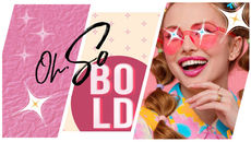
The Art Of Standing Out On Purpose


Minimalism had its moment—clean lines, quiet palettes, and “please-don’t-notice-me” branding. But in 2026? We’re done whispering. Maximalism is back, and it’s showing up loud, layered, and unapologetically extra.

Just like fashion’s obsession with bold accessories (think brooches, bangles, and bead overload), branding is embracing a “pile it on” mentality—because why blend in when you can make a statement?


From Minimal To Maximal: The Glow-Up

Let’s be real: audiences are over safe, sterile, one-size-fits-all design. They want flavor. They want spice. They want brands that ditch the grayscale templates and show up like they’ve got something to say—and the confidence to say it in technicolor.


The shift to maximalism isn’t random—it’s a cultural snapback. In an overstimulated world, the brands that cut through are the ones that dare to be bold, layered, and unmistakably themselves. Add in the need for visual storytelling and authenticity, and suddenly a little (or a lot of) flair makes perfect sense.


Nike’s doing it. Anthropologie’s deep in it. And the rest of us? Time to trade in our neutral tees for something with serious personality.


Why “More Is More” Just Makes Sense

  • Personality > Perfection

    Consumers are vibing with brands that feel real. Not polished to the point of being forgettable. We’re in the era of quirk, not cookie-cutter.


  • Instant Impact

    When everyone’s scrolling at the speed of light, bold design is your brand’s neon “LOOK AT ME” moment.


  • Layered Storytelling

    Every detail—every texture, stroke, and unexpected element—is another beat in your brand’s story. Add depth, add meaning, add intrigue.


Style Cues From Fashion’s Maximalist Moment

Need inspiration? Look to the runway. Schiaparelli’s brooches, Chanel’s wrist-full-of-bangles, Marni’s beads that could double as modern art. Statement accessories aren’t just about style—they’re about storytelling through excess. Branding? Same energy.


Here’s How To Translate That Maximalist Magic Into Your Next Design:

  • Color Like You Mean It

    Toss the beige. Go bold. Think electric palettes, playful type, and high-contrast pairings that can’t help but stand out.


  • Layer It On

    Mixed media isn’t just for art school. Add texture, depth, patterns, illustration, even a hint of grain. Your flat design deserves a little drama.


  • Make It Personal

    Custom fonts. Cheeky icons. Layouts that play by your own rules. Infuse your work with personality, because nobody remembers the brand that played it safe.


Maximalism Mirrors The Moment

Let’s zoom out for a second. The return of maximalism isn’t just a design trend—it’s a cultural vibe shift. After years of uncertainty, constraint, and doomscrolling, people are ready to feel something again. Bold design scratches that itch. It brings energy, optimism, and a bit of joyful chaos into the frame. Think of it as visual dopamine. Brands that tap into that feeling—that “finally, something different” reaction—create a stronger emotional pull. It’s not about being loud for the sake of it. It’s about giving people a reason to stop scrolling, look twice, and say, “that’s cool—and that’s totally them.”


The Final Word: Stop Toning It Down

2026 isn’t the year to blend in. It’s the year to bring the full look. The layered, the textured, the vibrant. The you.


Whether it’s a bold necklace or a bold design move, the brands that turn heads are the ones unafraid to show off what makes them different.


Go ahead—accessorize the hell out of it.


Everything we share here is meant to be helpful and inspiring. We’re speaking from experience. Please consult a qualified professional to help make decisions. You are responsible for how you choose to use this information, and we are not liable for any loss, damages, or issues that may arise. We can’t be responsible for how things play out, but we’re always rooting for your success!


Credits

Author: Hannah Heine

Editor: Jenn Hart (More About Me)

Associate Editor: Sarah Dawoud

Art: Sharon Bakas

Popular Related Articles

Subscribe to The Squeeze on our little piece of the internet to get design promotions, resources, stories about other creatives, and inspiration for your eyeballs and brainstorms.


Keep creating Hartists! Follow @harthousecreative on Instagram and Linkedin.

 
Subscribe
Hart House Creative Logo and all its certifications in white

CONNECT + SUBSCRIBE

Thanks for submitting! Please make sure to check your spam folder. Even the best of us get called junk sometimes.

  • Youtube
  • Spotify
  • Instagram
  • LinkedIn

@harthousecreative

Hart House Creative, its employees, partners, The Squeeze, and guest writers make no guarantees for results. Methods and marketing suggestions are based on prior knowledge and intended to inspire business owners and other creatives. Every person has different goals. None will be held liable for any negative results achieved from implementing suggestions from our website.


© 2025 Written and Red, LLC, DBA Hart House Creative®. All rights reserved.

Las Vegas / Philadelphia

bottom of page