
Spin The Color Wheel. See Where It Takes You!
- Mar 20
- 5 min read
Updated: Mar 24

The chromatic circle, or color wheel, shows the relationships between colors. But what else does it show? It could offer a glimpse into your brand and how you present yourself.
Graphic designers can use color strategies informed by the color wheel to make brands sing and ring true across all your marketing, collateral, ads, and website. Color palettes, designed well, can be as effective as any design element at making your brand stand apart from the rest.
Find Some Harmony
So what is the chromatic circle? Primary, secondary, and tertiary colors—all in a circular tool that allows designers to see how different colors interact and work together (or not). In other words, graphic designers use this tool to develop a color strategy grounded in color theory. A few simple examples to start are below:
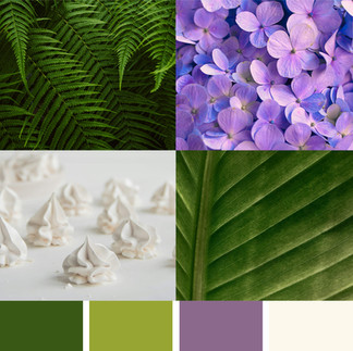
Example Palette: Analogous Palette using Neutrals
Theory Applied As Strategy: Analogous colors are groups of three to five colors located directly adjacent to each other on the color wheel. Using colors with similar values can create a sense of elevation, calm, and ease. Depending on the mix, this concept could also feel overly serious or even boring. With this strategy, application is crucial to the overall strategy. The close values can create a flow for the brain to follow without high-contrast interruptions, bringing modern clarity and a sense of freshness when well designed. In this concept, the palette is a quieter element of the brand. Quiet but intentional. The neutral component could support an earthy feeling, a modern sensibility, or a moody, rich impression.


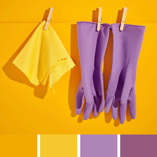
Example Palette: Complimentary + One
Theory Applied As Strategy: Complementary colors are exactly across from one another on the color wheel. Think of them like two magnets pushing against each other. There is a natural vibration that happens with color opposites. It can go wrong if used carelessly, causing readability issues and an unpleasant experience when viewed together. However, including two complementary colors in your palette, paired with neutral or base colors that harmonize with them, can ground them. This technique builds a landing strip for the louder colors in the palette and creates an opportunity for excitement. That vibration can now be used to direct attention, energize, and introduce a surprising element.


Example Palette: Analogous + One
Theory Applied As Strategy: Building on what we know about analogous color systems, this strategy hacks that system by introducing a single high-contrast color to create moments of disruption and surprise, combining the core principles of a complementary palette and an analogous one to develop a strong brand element. This strategy works well for many industries and brand personalities. Some we have personally used this strategy for include: luxury products and services, personal brands, and purpose-driven businesses.


Break the Mold With Colors That Work Harder
Designers explore colors and combinations that evoke something. That something depends on the business that is being communicated and its goals. This is why it is crucial to take time to understand your goals and values, and position in the market before building your brand identity elements. Warm colors can convey energy, passion, and warmth. Cool colors can give a more calm, professional tone. Using the chromatic circle to compare and contrast colors can help create a palette that you and your brand can own.
Resources inspired By This Article
Transparency note: Some links in this article are affiliate links. If you purchase through them, we may earn a small commission at no additional cost to you.
Find the Colors in Your World
It’s always good to have a (color) bible on your desk for reference and inspiration, and we have a few books and resources we love that can go a long way toward helping you find the perfect color combination for your brand. Peruse at your leisure:
Make Color Count
The color wheel is a powerful tool for designers, but it’s also an important resource for anyone thinking about how their brand should appear in the world. How does this color (or that color) invoke a certain emotion? How does one color combination create a gut-level feeling versus another?
Our team is always hard at work using color to make our clients’ brands stand out. Take a look >>

Spin the wheel and find which colors
work in harmony for your brand.
What does your color scheme feel like? Try it on a social graphic or a page design for your website? Seeing the palette in practice can help you identify problem areas or incongruent colors that aren’t sending the message you want.
Ask yourself—does it feel balanced? Do your colors work together?
A few online tools to consider:
Adobe Color: If you already have a subscription, this tool is straightforward to get you started.
Canva Color Wheel: If you are not a designer with access to the Adobe suite, we have found this free resource to be worth exploring to get your color theory mojo moving.
Credits
Editor: Jenn Hart (More About Me)
Associate Editor: Sarah Dawoud
Art: Sharon Bakas

Author: John Flynn
John Flynn is a freelance writer with more than 20 years of experience in both the agency world and the corporate side. John has written and collaborated on award-winning campaigns for clients in the hospitality, automotive, healthcare, and financial industries.
Subscribe to The Squeeze on our little piece of the internet to get design promotions, resources, stories about other creatives, and inspiration for your eyeballs and brainstorms.
Everything we share here is meant to be helpful and inspiring. We’re speaking from experience and past proof of concept. We respect each other's works, cultures, and opinions. The trends, examples, and observations in this article are provided for educational and inspirational purposes only. Mentioned brands, businesses, and cultural references are not affiliated with or endorsing this content. Opinions on all subject matter, audience behavior, and strategies are general observations and may not apply to every audience or situation. Always consider your brand values, goals, and audience sensitivities before implementing changes or creating new visual content. Please consult a qualified professional when needed to help make decisions. You are responsible for how you choose to use this information, and we are not liable for any loss, damages, or issues that may arise. We can’t be responsible for how things play out, but we’re always rooting for your success!
Sources:
Popular Related Articles


