Print’s Not Dead…It’s Just In Its Less Is More Era
- Mar 5
- 4 min read
Updated: Mar 24

Good Print With Lib Ramos
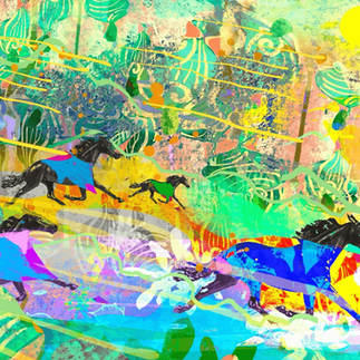
Who says print is dead? In ever changing digital world, print often takes a side seat to all things online. But a growing number of talented designers, publishers and printers are making sure that print finds its place in the tech-driven landscape of twenty-first century design and thrives in it. Lib Ramos is one of those talented professionals. She’s the designer and founder of Good Printed Things. Since 2018, she’s been bringing her diverse design background and experience to the table to support artists and writers through the print process. When it comes to using color, she has a few things to say…
Q&A
What types of projects are you currently working on?
Creating new books and local maps are my primary print projects at the moment. I'm a big reader and love being part of the publishing world.
What's your process for building a color palette?
I typically start with the subject matter or theme of the project I'm working on, but I love finding color inspiration for my design work in unexpected places. Lately, shoes and outdoor bags have caught my eye as a great source for unexpected color combos. I have so many random photos and screenshots of color inspiration on my phone. I even started a Pinterest board to reference fun color combos I want to refer back to.


Do you have any favorite color schemes you revisit often, or do you tailor your use of color for each individual project?
I create a new color palette and mood board for each project, but still often find myself gravitating toward shades of green. Sometimes I have to intentionally push myself into other color combos because that seems to be a default for me.
Does your approach to using color change for printed pieces versus digital work?
My focus these days is primarily print design. When it comes to choosing colors, I try to consider accessibility and readability. Interestingly, I've found there are many tools for testing contrast and accessibility for the online world, and not many (none?) for testing accessibility for print. I also choose colors that will reproduce well in CMYK for print, and while that removes some vivid colors from the mix, it's important to understand that not every color can be reproduced the same on-screen and off-screen.
What value do you think color brings to design besides the simple aesthetic?
Color and design often work hand-in-hand to create something that's eye-catching. I think design can (and should) still be able to communicate well if it's just black and white, but adding color creates an entire new dimension to work with. Right now, I'm working on a zine project that will utilize a single-color ink throughout, instead of black. It's a really unexpected thing to do these days when digital printing options make it easy to use all the colors. For this project, a limited palette isn't just a budget-friendly option, it gives the project a wonderful grassroots feel that fits the subject matter.

More of Lib's Work
To see more of Lib’s work at Good Printed Things, check out goodprintedthings.com or visit them on Facebook.
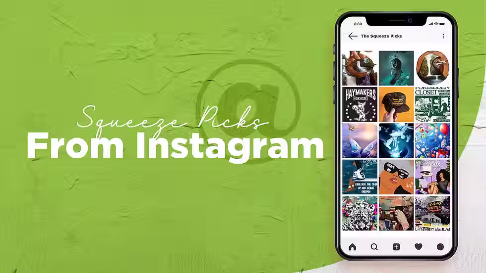
SUPPORTING ARTISTS
We’re always on the lookout for artists that inspire us, push us, surprise us, and make bring joy to our day. Here are a few artists that our team has been following lately:
@evacremers - Digital creator and 3D artist.


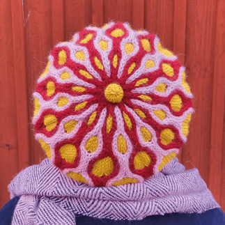
@klarybarry - colorful knitwear made in Sweden


@kateartnyc - digital artist from New York


Katharina Grosse - modern artist from Germany


Everything we share here is meant to be helpful and inspiring. We’re speaking from experience and past proof of concept. We respect each other's works, cultures, and opinions. The trends, examples, and observations in this article are provided for educational and inspirational purposes only. Mentioned brands, businesses, and cultural references are not affiliated with or endorsing this content. Opinions on all subject matter, audience behavior, and strategies are general observations and may not apply to every audience or situation. Always consider your brand values, goals, and audience sensitivities before implementing changes or creating new visual content. Please consult a qualified professional when needed to help make decisions. You are responsible for how you choose to use this information, and we are not liable for any loss, damages, or issues that may arise. We can’t be responsible for how things play out, but we’re always rooting for your success!
Credits
Author: John Flynn
Editor: Jenn Hart (More About Me)
Associate Editor: Sarah Dawoud
Art: Sharon Bakas

John Flynn
John Flynn is a freelance writer with more than 20 years of experience in both the agency world and the corporate side. John has written and collaborated on award-winning campaigns for clients in the hospitality, automotive, healthcare, and financial industries.
Popular Related Articles
Subscribe to The Squeeze on our little piece of the internet to get design promotions, resources, stories about other creatives, and inspiration for your eyeballs and brainstorms.